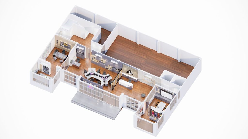
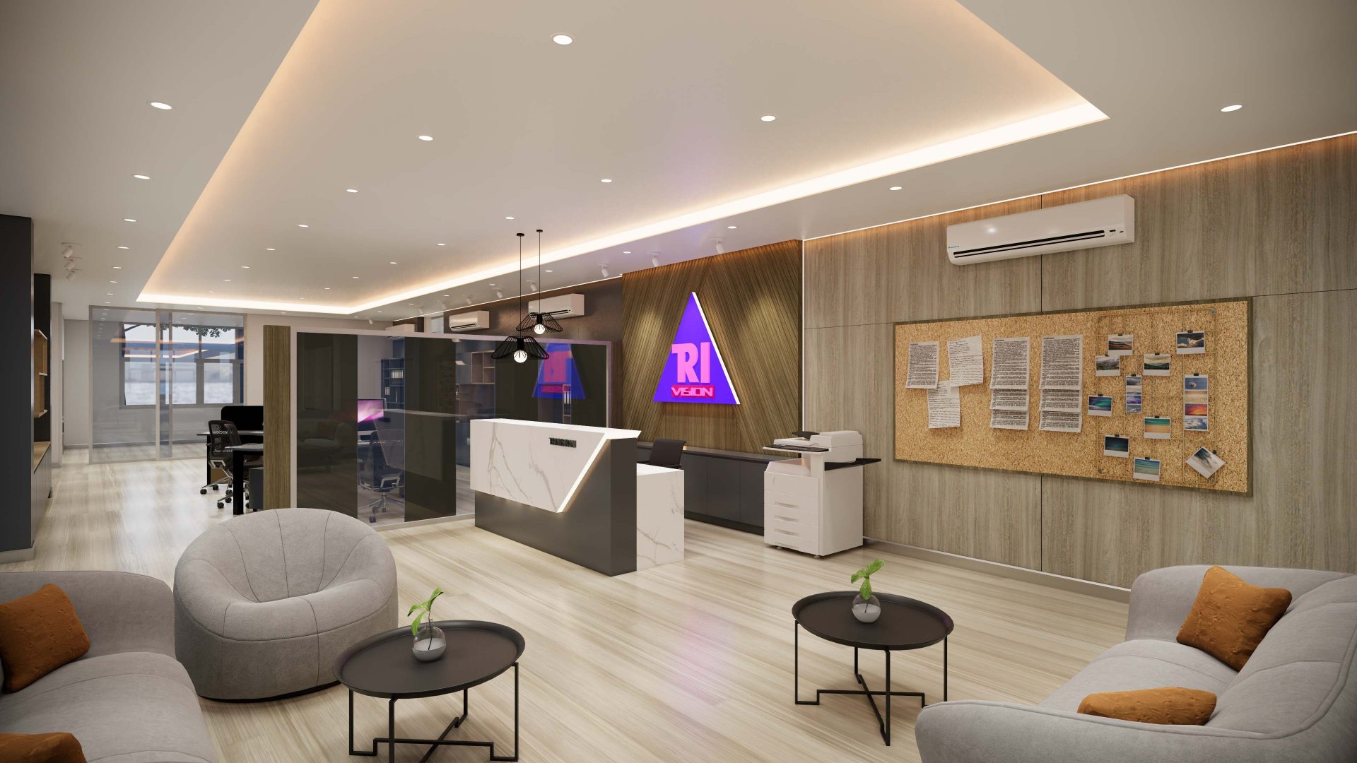
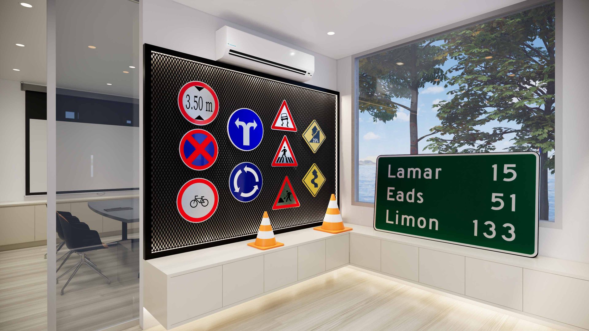
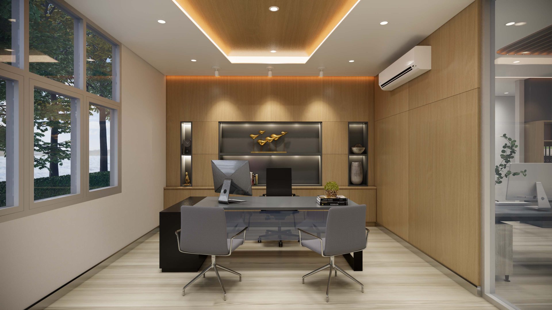
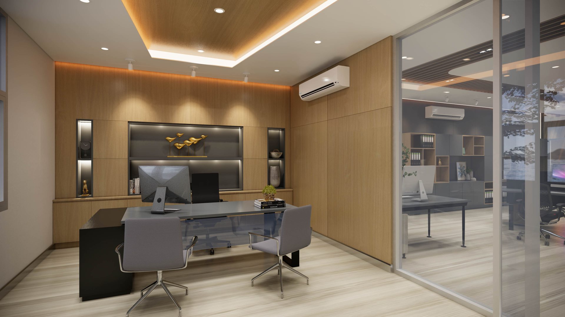
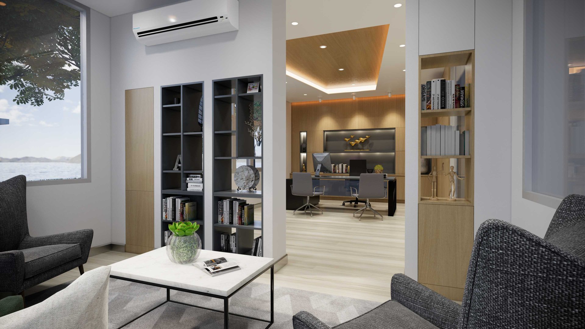
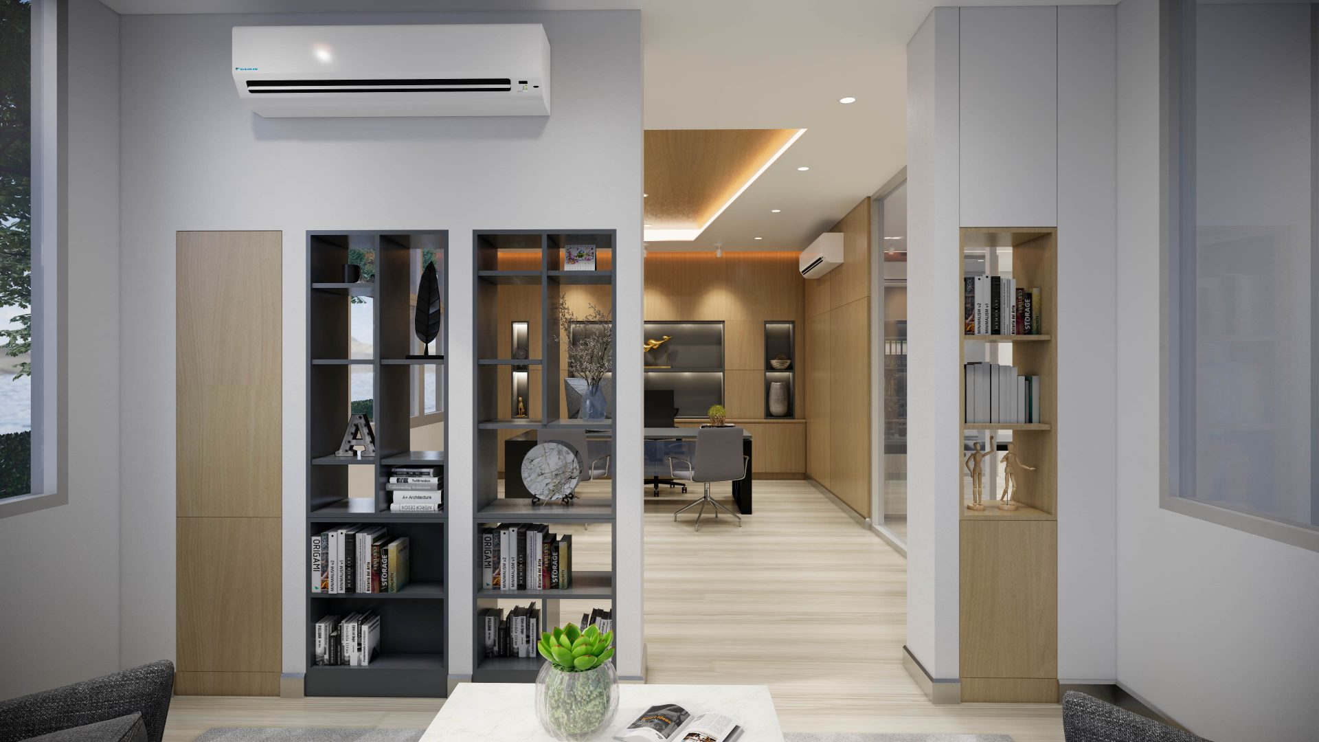
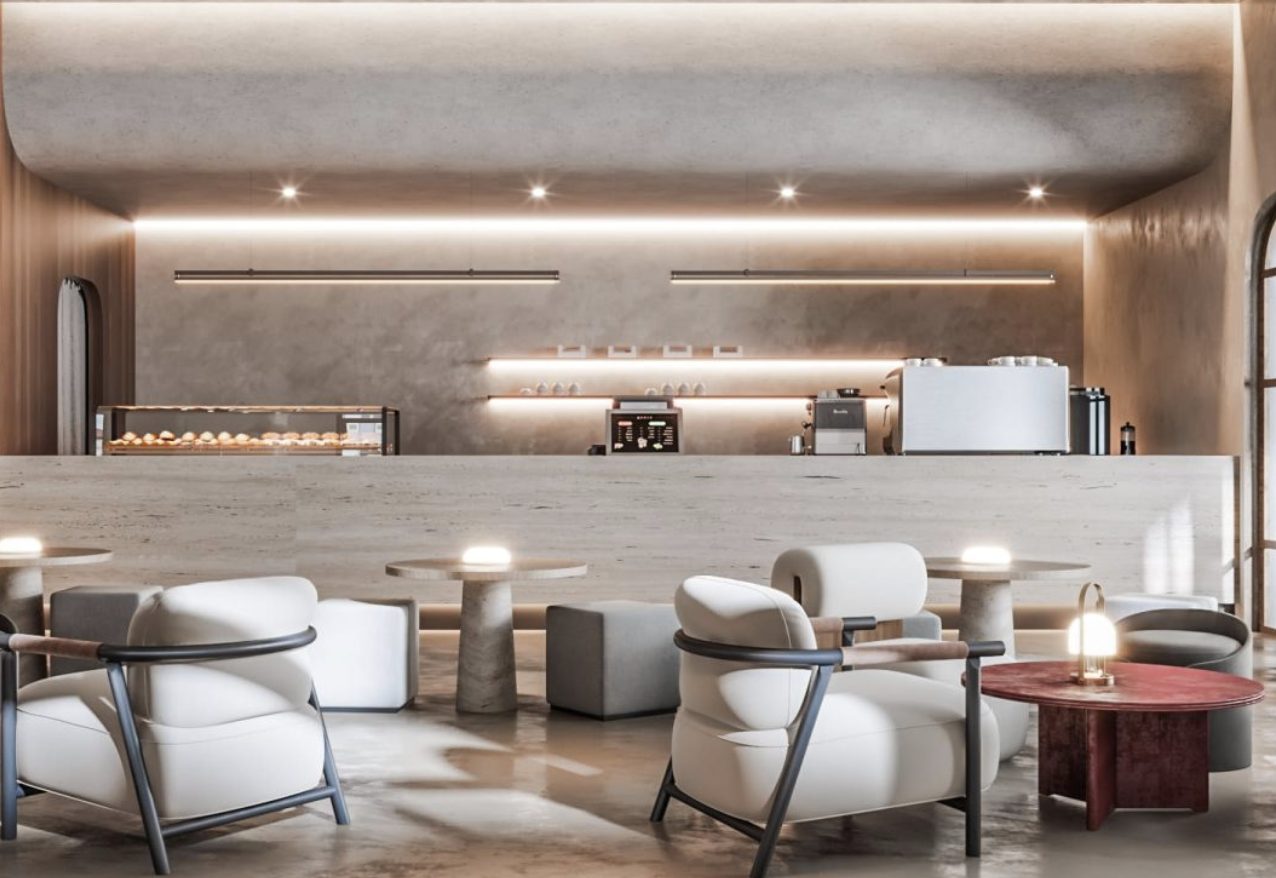
This is the design of a modern-style showroom for Trivision, a traffic sign and equipment supplier. The two-story space consists of an office and a showroom, with the lower floor featuring product displays, a customer reception area, employee zones, and executive rooms. The color scheme incorporates a mix of dark, medium, and light tones to create a dynamic and contemporary office atmosphere. Furniture choices predominantly include gray and black tones to match the laminate wood used on the ceilings, walls, and floors.
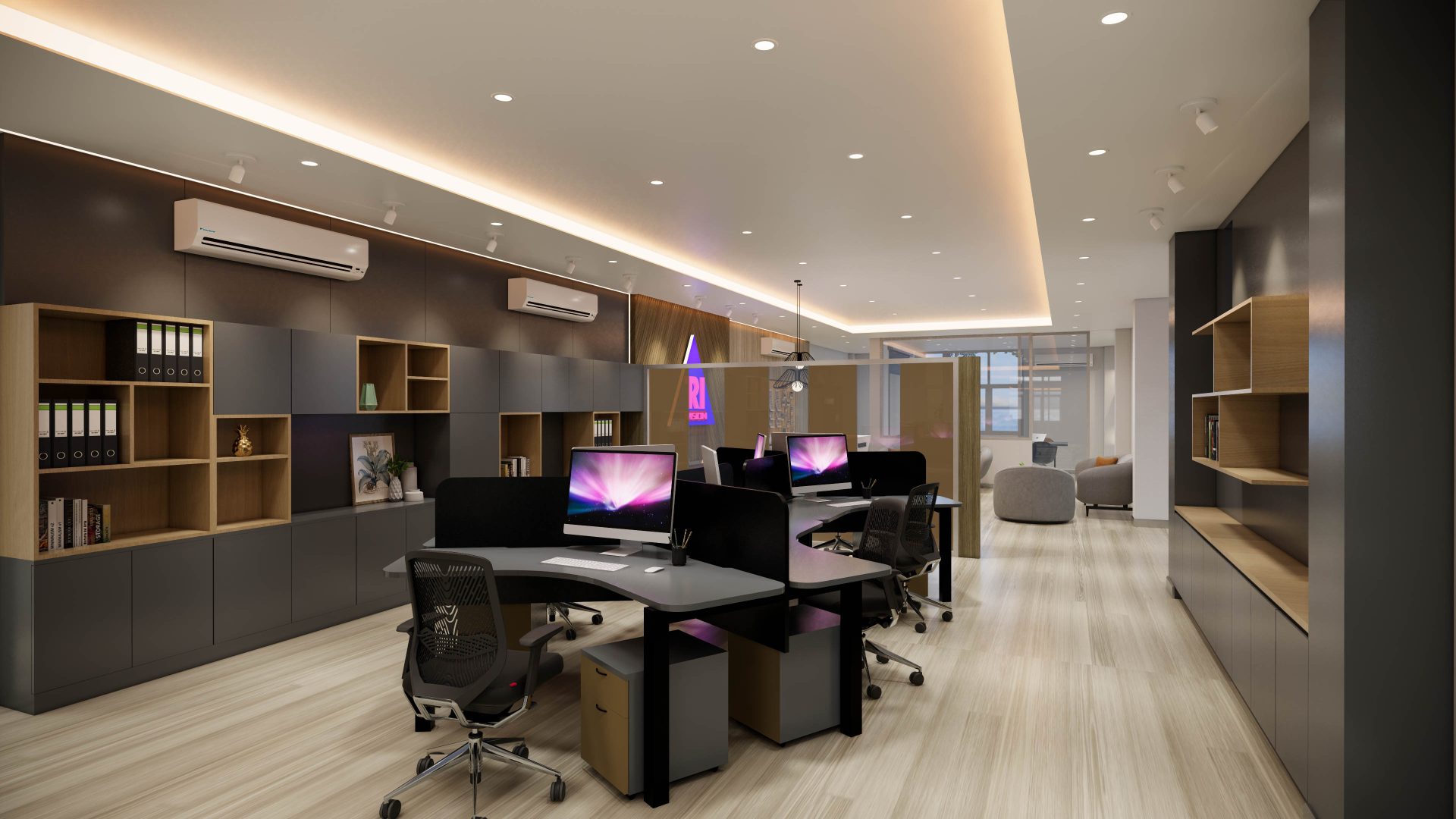
The office space for employees is designed with corner-facing workstations, providing a level of privacy. Floating drawers are available at each seating area, while the color palette in this room focuses on shades of gray to create a comfortable working environment. Built-in shelves and cabinets are incorporated for file storage and organization, with a large partition separating the reception area from the office, constructed with laminate and silver-black aluminum panels to create a visual barrier.
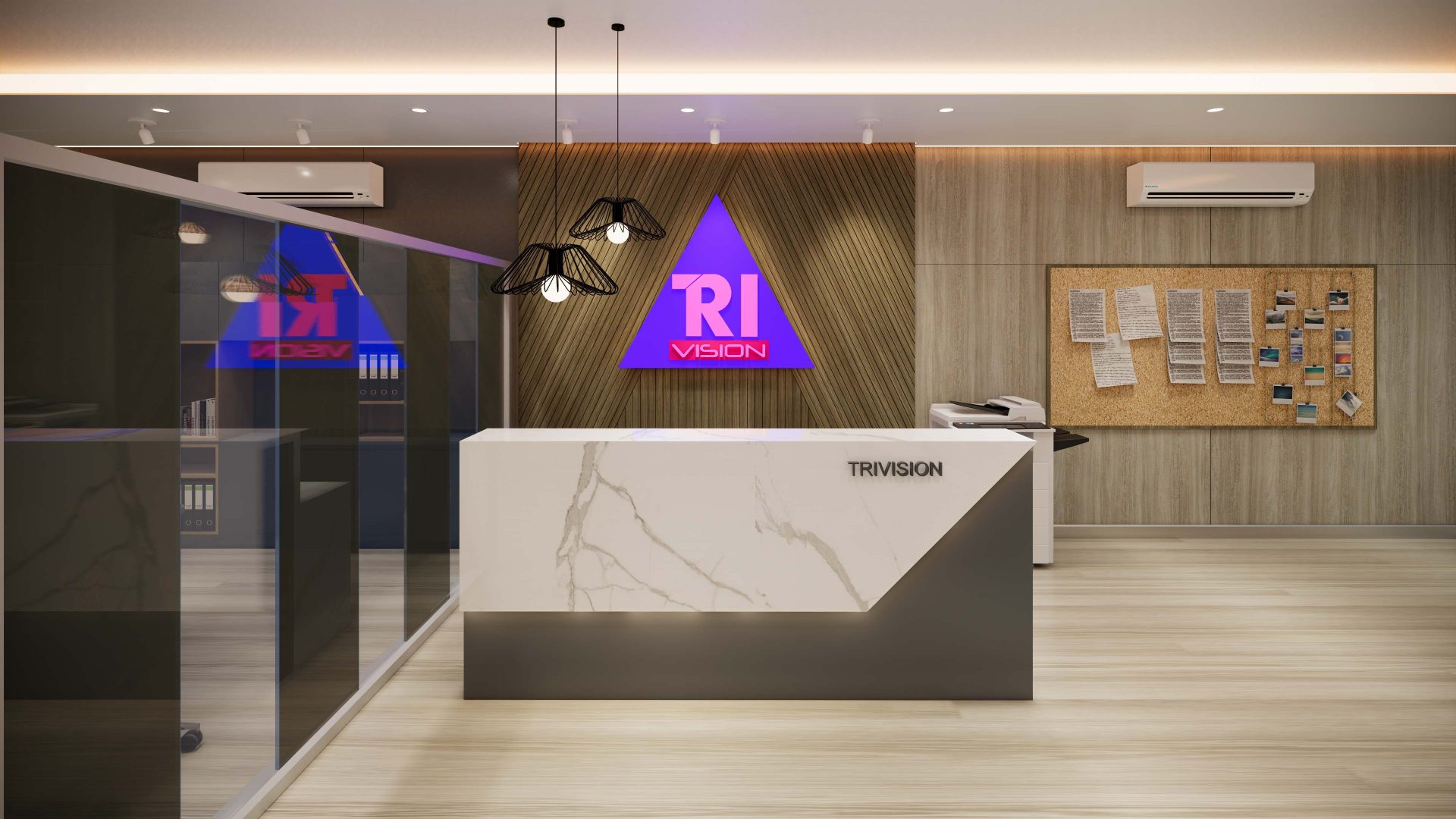
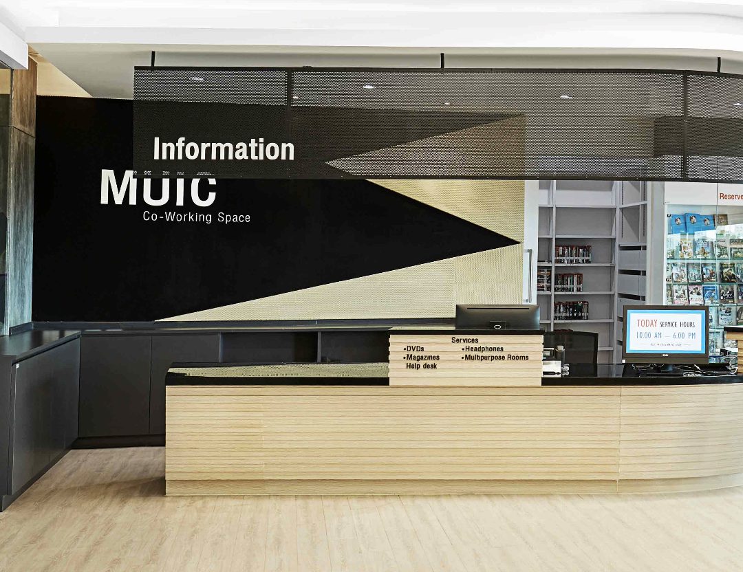
The reception area features adequate lighting and a countertop made of soft stone, with a slanted wooden panel at the back incorporating the company logo, adding dimension and attracting attention.
Glass panels are utilized on the sides of the work area to allow visibility of office activities, while the entrance is designed to be open, providing a sense of privacy without isolating communication from other zones. The ceiling is designed with dropped sections and accentuated by wooden patterns, creating a spacious and expansive feel.
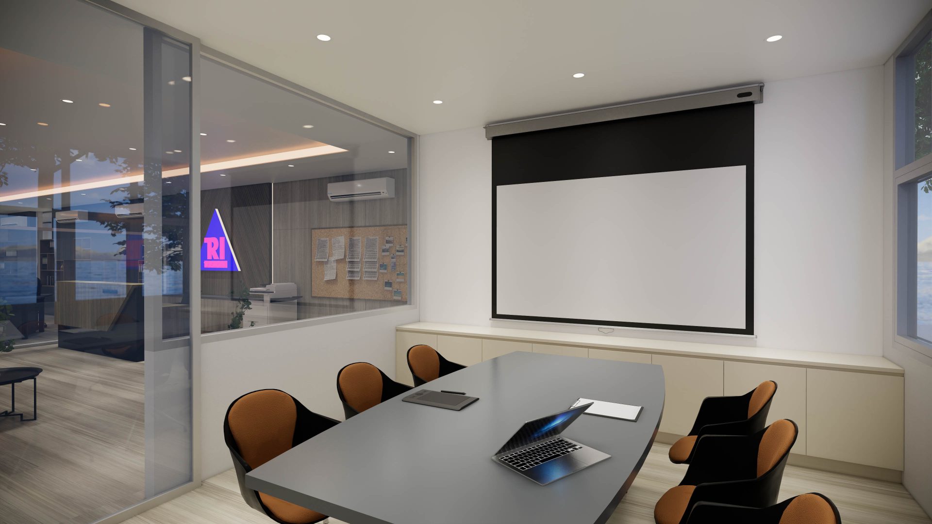
The meeting room is designed with simplicity in mind, featuring a white color scheme and clear glass panels on the sides to prevent the room from appearing small or cramped. The walls are kept plain white to accommodate projector presentations, and the furniture is arranged to allow comfortable viewing of presentations.
